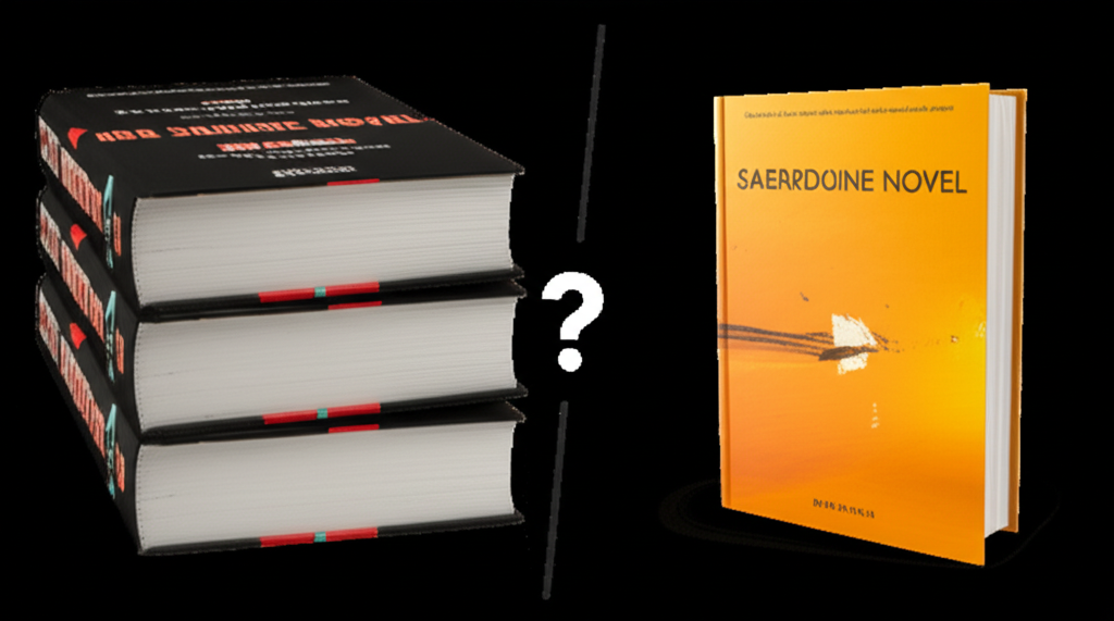
First Impressions Matter
In the world of books, covers are everything. Studies show that readers make judgments about a book's quality and relevance within just 3-5 seconds of seeing the cover. This makes your cover design one of the most critical marketing tools at your disposal.
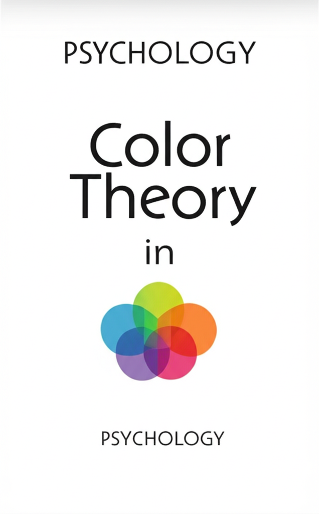
Color Psychology in Book Covers
Different colors evoke different emotional responses from viewers:
Red
Signals excitement, passion, and urgency. Often used in thrillers, romance, and books that deal with intense emotions.
Blue
Evokes trust, calm, and professionalism. Common in business books, self-help, and certain types of literary fiction.
Yellow
Creates feelings of optimism and clarity. Popular for self-improvement, happiness-focused books, and some comedies.
Black
Suggests sophistication, mystery, and authority. Frequently used in thrillers, horror, and high-end non-fiction.
Typography and Readability
Your title needs to be readable at thumbnail size, as most potential readers will first encounter your book as a small image online. Consider these principles:
1. Contrast
Ensure strong contrast between text and background. Low contrast makes titles difficult to read, especially at smaller sizes.
2. Font Selection
Choose fonts that match your genre's expectations. A romance novel with a horror-style font will confuse readers, while a thriller with a whimsical script font will send mixed signals.
3. Hierarchy
Create a clear visual hierarchy between title, subtitle, and author name to guide the reader's eye through the cover in the intended order.
Genre Conventions: The Visual Shorthand
Each genre has established visual conventions that signal to readers what kind of book they're looking at:
Romance
Often features couples, elegant script fonts, and soft, warm color palettes.
Thriller
Typically uses dark backgrounds, high contrast, bold sans-serif fonts, and imagery that creates tension.
Fantasy
Frequently includes illustrated elements, ornate fonts, and symbolic imagery related to the world within.
Testing Your Cover Design
Before finalizing your cover, test it with your target audience. Read & Rate members can use our Cover Feedback feature to get honest opinions from readers in their genre before publication.
Case Study: A Cover Redesign Success
One of our authors saw a 215% increase in click-through rate after redesigning their cover based on these psychological principles. The key change was aligning the cover more closely with genre expectations while maintaining the book's unique identity.